snacktime! with ali tomek
april 2021
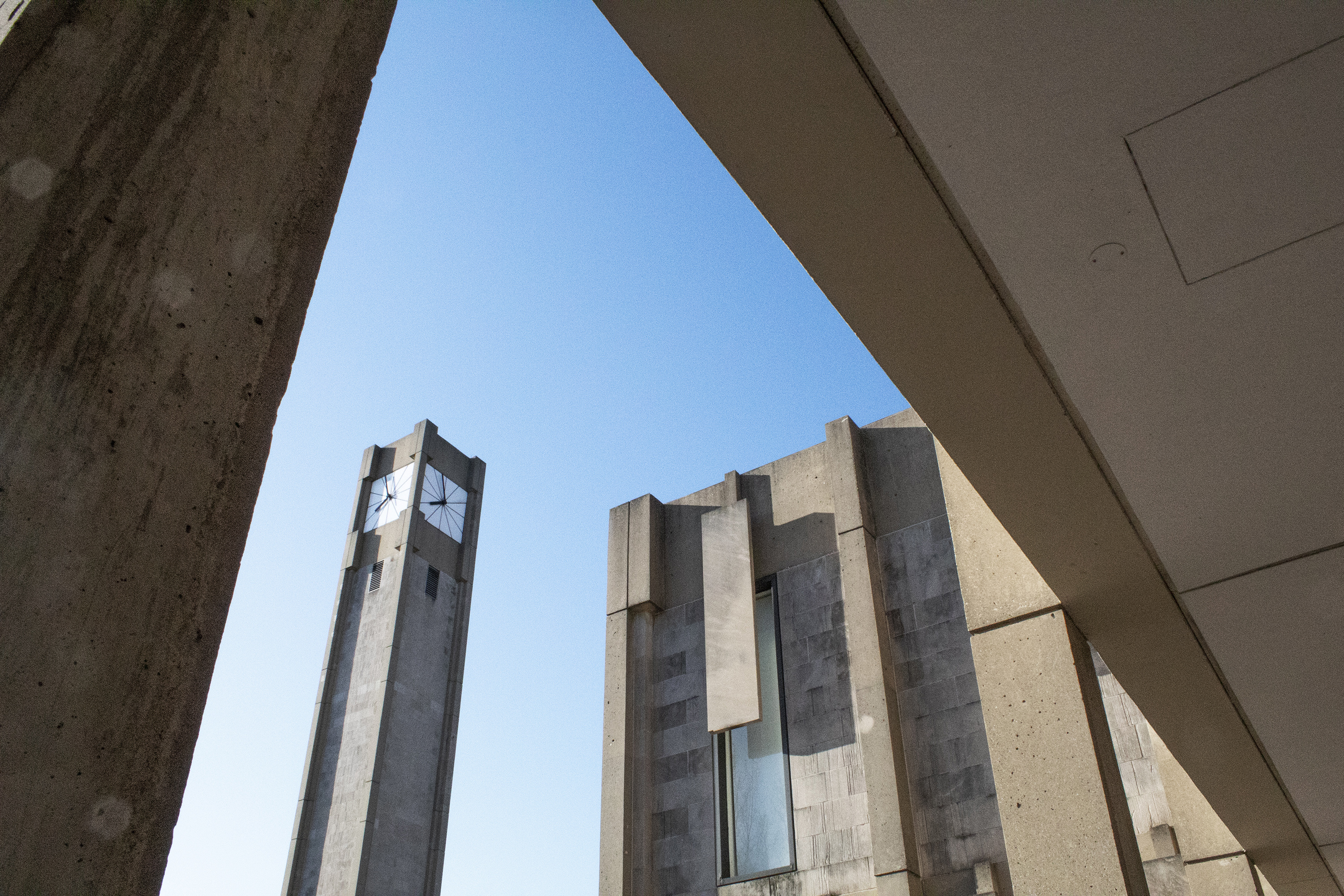
 The clock tower at Rebecca Crown Center, designed by Walter Netsch (Skidmore, Owings & Merrill) in 1968. The Rebecca Crown Center houses administrative offices. Courtesy Ali Tomek.
What was your favourite study snack at Northwestern? Did it change during your studies at the School of the Art Institute of Chicago (SAIC)? What is it now?
I am very susceptible to the convenience of vending machines. During undergrad, I ate a lot of Snickers bars. At SAIC, I “upgraded” to trail mix. Now, I’m in a very intense veggie straws phase. They are basically potato chips dressed in spinach powder and tomato paste. Yum!
How are you doing these days? What’s on your mind right now?
The essay I wrote for Plates was the starting point for a lot of what I’m thinking about now. I currently design for a Chicago firm with a lot of architecture clients including The Pritzker Architecture Prize. I’m also teaching Beginning Graphic Design at SAIC.
I’m really intrigued by the areas where graphic design and architecture overlap. For example, are websites architecture?
Or, what does it mean to teach graphic design via Zoom, where we can’t be in the same room physically, but we can use Google Docs to share a virtual space? Editing a shared document at the same time as 15 other people is strangely satisfying. You get close to people’s thought processes as they type and delete and rearrange information. In those moments, it’s kind of a raw experience, which contrasts with the typical seamlessness of these tools.
You attended SAIC after your studies at Northwestern. SAIC isn’t that far from Northwestern—about an hour by public transport on a good day—but SAIC is a very different brand of school with a very different kind of campus. Could you talk a little about how the two schools differ in identity in your experience, and how this manifests in their architectural choices?
It’s an interesting comparison! As I alluded to in the Plates essay, Northwestern is constantly repositioning itself through architecture. A new athletic facility is not just a nicer field. It’s a signal to prospective students that Northwestern offers great sports teams. With better athletes, the university gets more national exposure, which attracts more students who might grow up to be the next Mike Greenbergs and Michael Wilbons and mention Northwestern on their daily ESPN shows.
Northwestern’s identity is more expansionist. There are 11 schools within Northwestern: engineering, journalism, music, medicine, and so on. SAIC, meanwhile, only has five main buildings. SAIC’s footprint is constrained by the density of downtown Chicago’s offices, hotels, apartments, and retail spaces. At SAIC, you don’t run into your friends on a wide, grassy meadow. You run into them waiting for the elevator to take you to the 11th floor.
SAIC generates exposure through its connection to a world-class museum that people strongly associate with Chicago. This connection produces an enduring identity. Through the museum, the school can build ties to innovative architecture.
As a graphic designer, how do you see corporate graphic design and corporate architecture relating? Is corporate graphic design as recognisable as the corporate architecture that you describe? Which is more pernicious?
Today, corporate graphic design is recogniszable as the land of templates and smooth, sans-serif wordmarks. Mobile drives these aesthetics—corporate graphics have to be efficient and recognisable on a phone screen that offers very little real estate for intricate details. Corporate design thus worships simplicity. Sometimes, simplicity can be a mask for more unsettling complexities.
In my mind, graphic design and architecture are intertwined. You can turn a building into a logo and vice versa. Beyond that, both are communication tools. Both shape public spaces, physical and virtual. Both drive particular ideas forward.
Are there any upcoming projects on your plate that you’d like to tell us about?
I’m working on a piece about architecture’s role in movies. I’m not sure what form it will take, but I love watching films through this lens. Are buildings characters as much as the actors? Why do movies incorporate very specific styles of architecture? Why, for example, would a psychological horror movie revolve around a mid-century modern house?
Interview conducted early 2021
